

Showship
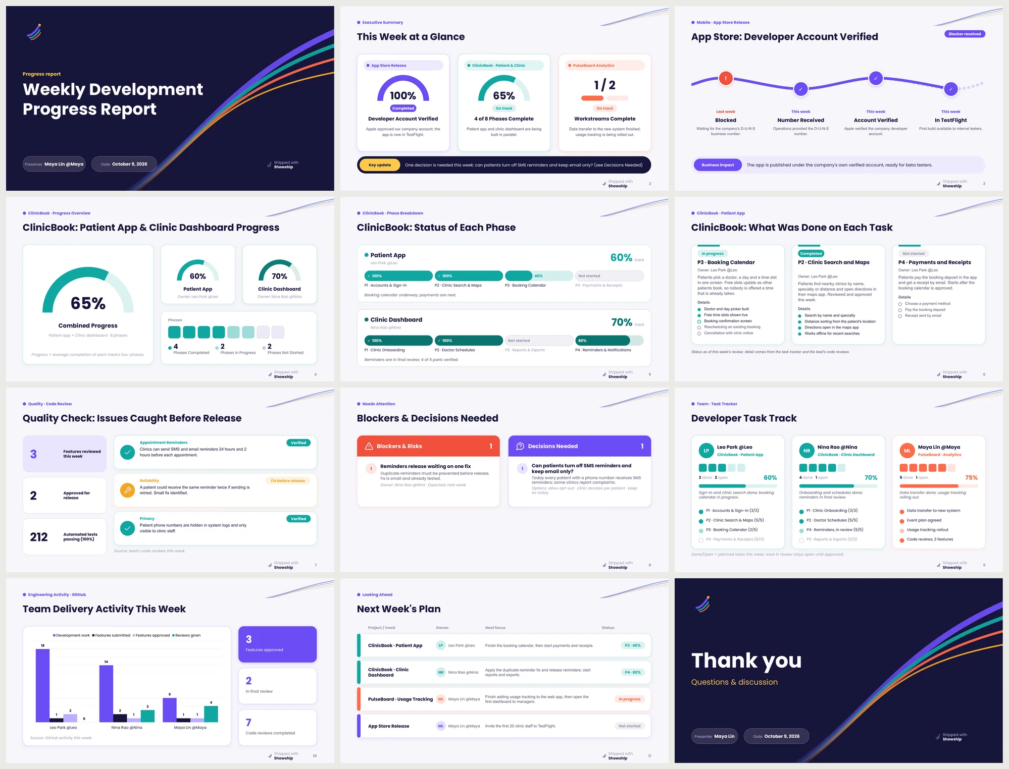
The signature design. Every project gets its own colour, carried from the dashboard to the phase tracks, the task tracker and the next-steps table, so the audience can follow a project by colour alone.
Semicircle gauges, pill-track phase charts, a waffle of done and open tasks, a milestone trail for timelines, and ship-trail ribbons on the title slides. A small "Shipped with Showship" mark sits in the footer. Turn it off with "signature": false.
- Fonts
- Poppins and Arial
- Layouts
- Its own, for every slide type
Download the example deck (1.2 MB) See every slide

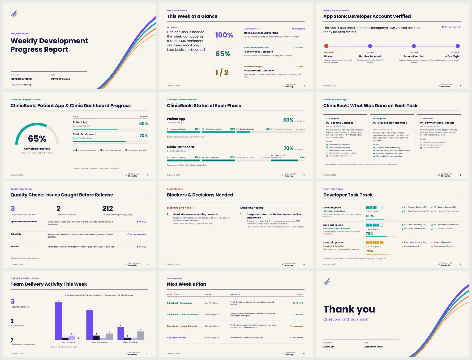
Paper
Set like a printed annual report. Paper background and navy ink, rules instead of cards, one big figure leading every slide, one colour per project. Coral red is kept for risks only.
Every slide type has its own composition. The rows layout does not draw illustrations in this design, so prefer a screenshot or plain rows there.
- Fonts
- Poppins and Arial
- Layouts
- Its own, for every slide type
Download the example deck (746 KB) See every slide

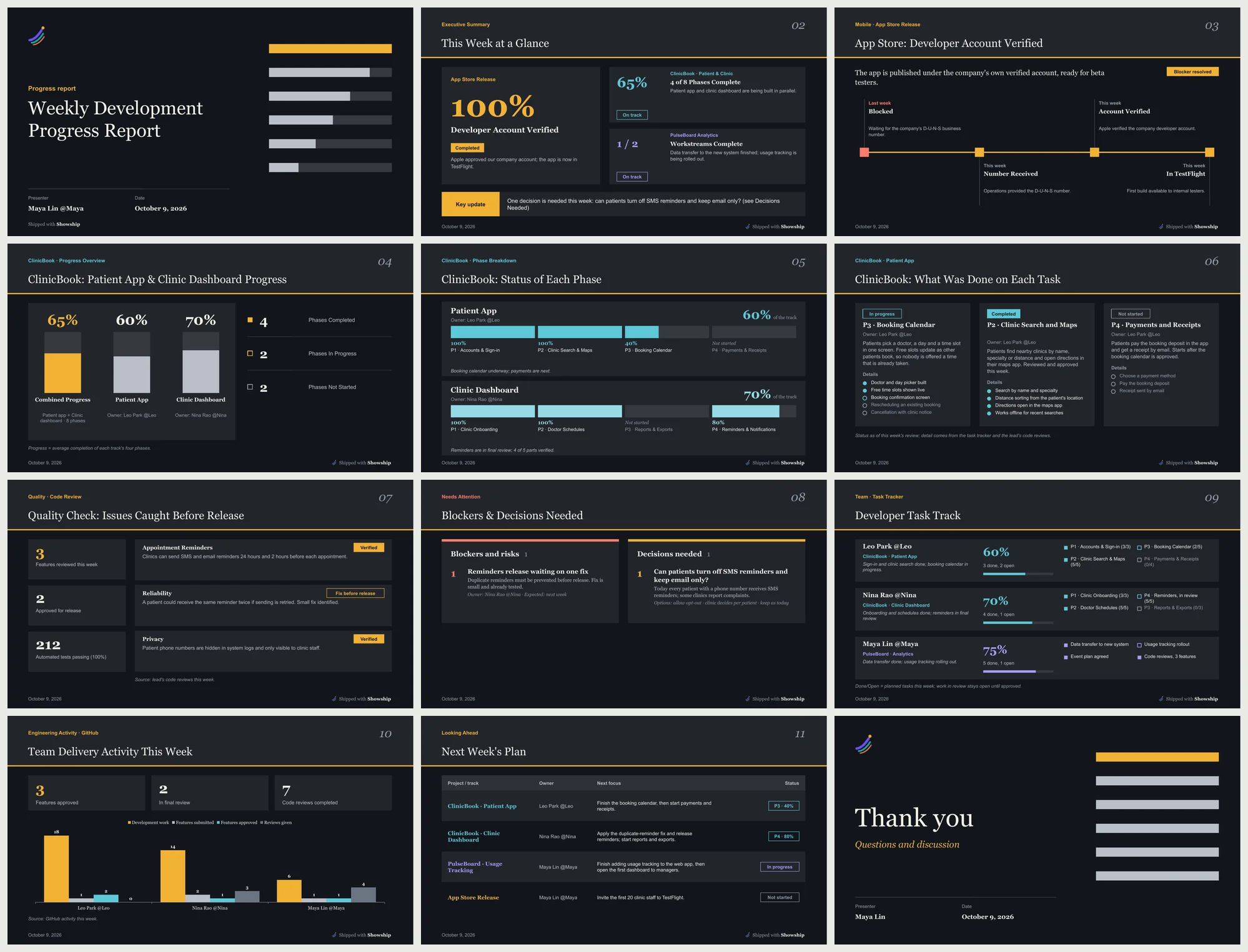
Ember
A dark deck for rooms where the projector is the brightest thing. Graphite slides, content on flat lighter panels with no shadows or borders, one amber accent for the focal point, and coral red kept for risks only.
Figures are set large in Georgia, and a big slide number sits in the header band. Every slide type has its own composition: a hero panel with one giant figure on the dashboard, vertical pillars for progress, a zigzag trail for timelines and banded rows. The rows layout does not draw illustrations in this design. The theme.dark colour recolours the whole deck, so give it a dark value.
- Fonts
- Georgia and Arial
- Layouts
- Its own, for every slide type
Download the example deck (632 KB) See every slide

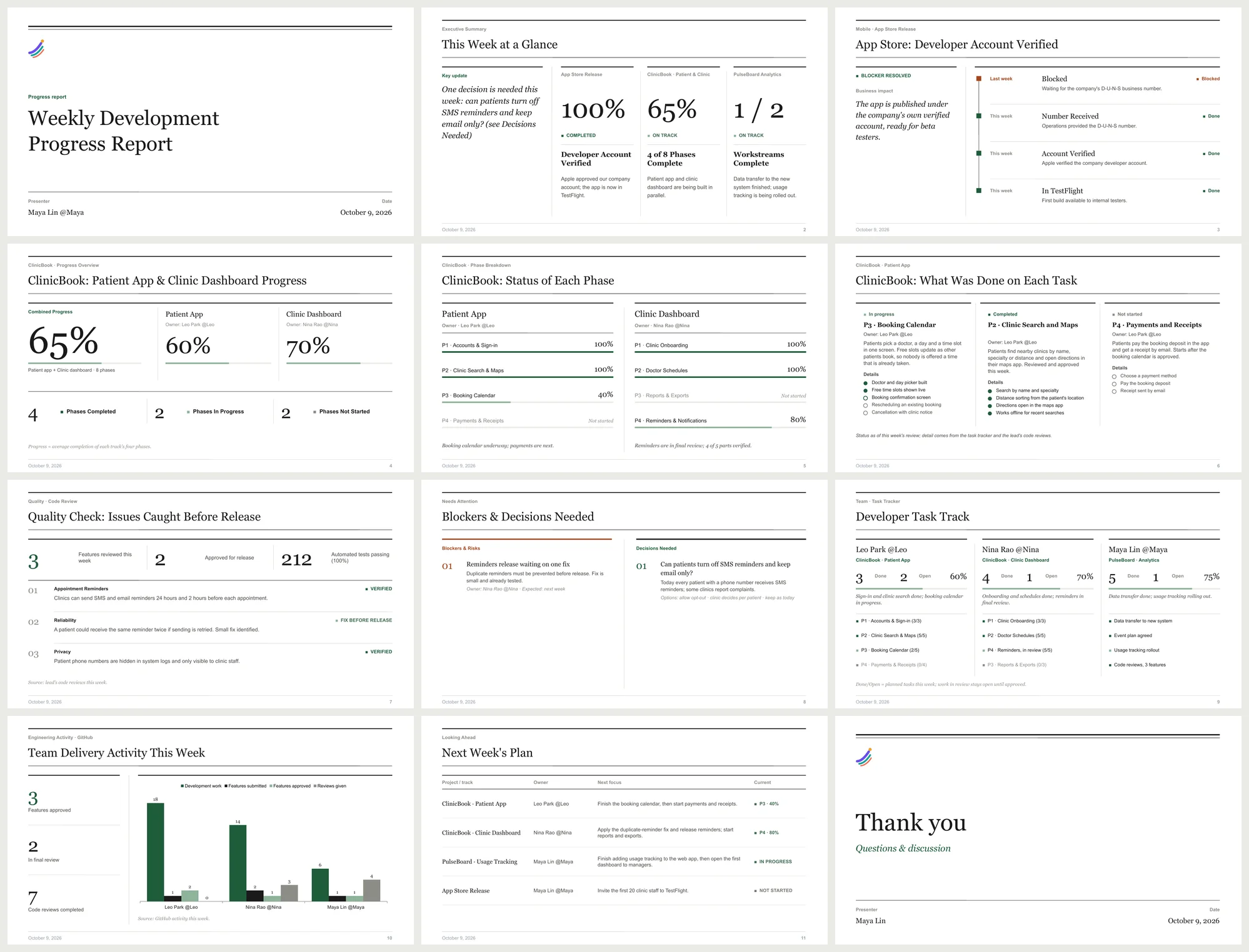
Classic
Black and white editorial with its own layouts: no boxes, a lede column for the key message, large serif figures, numbered entries, a vertical timeline and phase lists instead of bar charts. Heavy and hairline rules, one deep green accent.
- Fonts
- Georgia and Arial
- Layouts
- Its own editorial layouts
Download the example deck (491 KB) See every slide

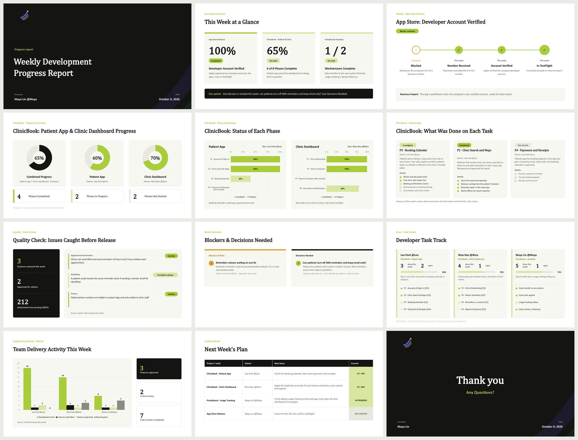
Modern
Dark title slides, a lime accent, serif headings and soft cards.
- Fonts
- Cambria and Calibri
- Layouts
- Shared card layouts
Download the example deck (566 KB) See every slide

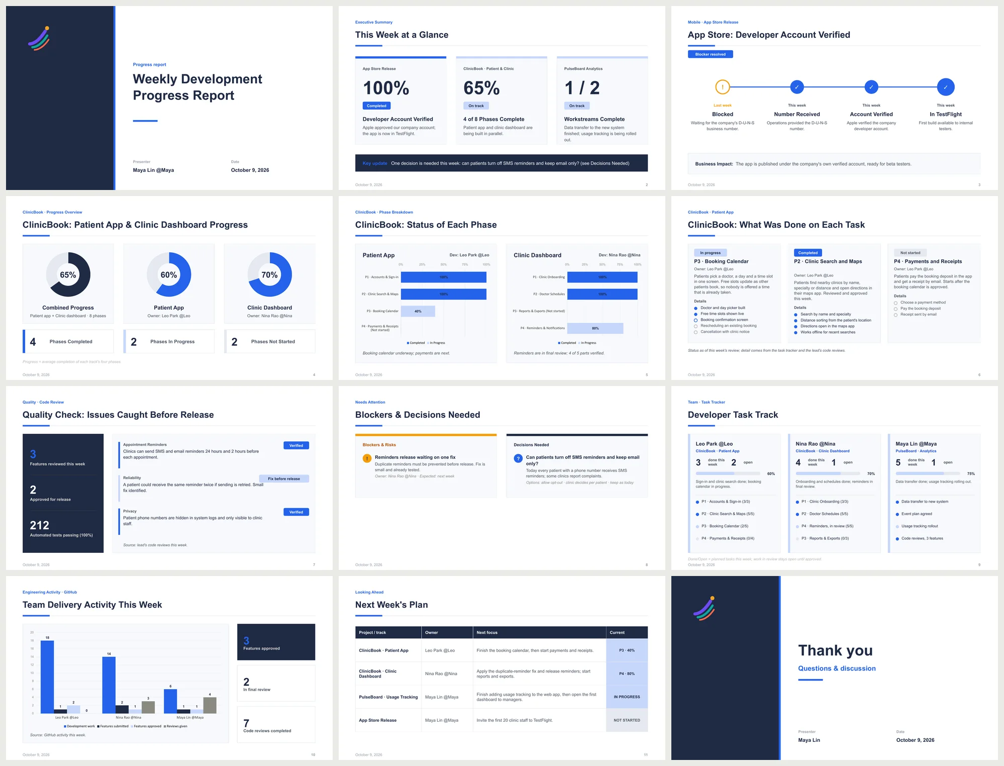
Corporate
White with a navy panel, a blue accent and clean sans-serif type, with page numbers in the footer.
- Fonts
- Arial
- Layouts
- Shared card layouts
Download the example deck (585 KB) See every slide

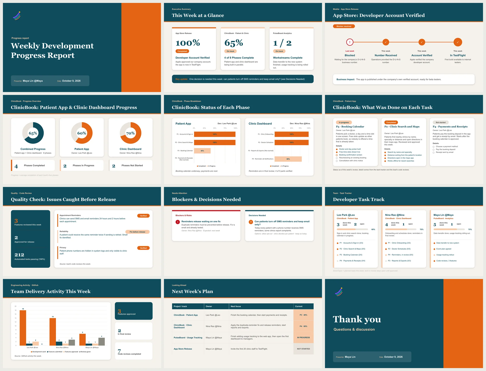
Vivid
A teal header band on every slide, an orange accent and rounded cards.
- Fonts
- Georgia and Arial
- Layouts
- Shared card layouts
Download the example deck (570 KB) See every slide

Choosing a design
Set it once, or override it for a single report. theme colours still override the design's palette, so you can keep a layout and use your brand colours.
PowerPoint substitutes a font that is not installed, so install the fonts your design needs. Poppins is a free Google font.
// config.json: the default for every report
"style": "vivid"

// report.json: this report only
"style": "paper"

// installer
npx showship --style corporate